Jekyll Sharp Styleguide Template
A fresh, lightweight custom built styleguide template to use with Jekyll sites. Just download or clone from the github repo and start building your site upon it!
Table of contents
- Requirements
- Features
- Quickstart
- Project structure
- Configuration
- Customize favicon
- Customize variables
- Assets
- Working with includes
- Modifying styles
- Helper classes
- Editing layouts
- Deploy your site
- Resources
- Changelog
Requirements
- A basic knowledge of HTML, CSS and Jekyll is required, however the usuage is documented in a short, clear format.
- Ruby and Jekyll set up on your computer
- Bunch of creativity to have the power to build your own custom site 😋
Features
- lightweight, rapid fast loading speed
- completely responsive using fluid layouts
- autoprefix css output for browser compatibility
- compress & minify all html, css and js output
- helper classes for a quicker workflow
- custom 6 columns responsoive grid system
- customized ordered & unordered lists
- includes a functional lightbox
- responsive typography and fonts
- form inputs styling (text, textarea, select, checkbox)
- code blocks with syntax highlighting
- copy a code block with one click function
- 260+ scaleable vector icons to choose from
- anchor links on every header with hashtag
- page loader animation effect
Quickstart
Clone this repo to your local machine:
git clone https://github.com/eriktailor/jekyll-sharp-styleguide.git
Open in your favourite code editor and run this command to install gems:
bundle
The project is all set up, you just need to serve it:
bundle exec jekyll serve
Or if you want to compile your project for production (minify, autoprefix, etc.), use this command:
JEKYLL_ENV=production bundle exec jekyll serve
Project structure
This is the directory structure of the project:
jekyll-rapid-styleguide/
├── _includes
├── _layouts
├── _sass
├── _site
└── assets
    ├── css
    ├── fonts
    ├── img
    └── js
What are these folders?
- _includes - contain partials and reusable components
- _layouts - contain the different site layouts. Currently only the default layout is used.
- _sass - here you can find the separate style files of each component and partial
- _site - jekyll builds (or serve) the project’s output in this folder.
- assets - containing the assets of the site, nicely separated in relevant folders
Configuration
As in every Jekyll project, the base configuration file is _config.yml in the project’s root folder. Feel free to open it in your text editor and customize the basic details of the site:
title: Jekyll Sharp StyleGuide
tagline: A styleguide template in Jekyll.
description: A fresh, lightweight custom built styleguide template in Jekyll.
author: ErikTailor
locale: en
You can obviously modify other settings in the configuration file as well, however it’s not needed for a typical usuage, as these settings cover the best setup for usuage of this styleguide template.
Customize favicon
Favicon (or site icon) is the tiny picture near the tab title of your website in a browser. If you have your custom image ready, go to the favicon generator and select your image. Customize the settings if needed, and make sure that the last setting Favicon Generator Options is set for locate favicons from a custom path (instead of project root) and enter /assets/img/favicons as a path. Finally download the generated package, and replace the original favicons in the project.
Customize variables
To modify the visual elements of the styleguide template, you have to adjust a the style setting variables in _sass/_variables.scss file. Open it up in your text editor, and customize it.
Options
Colors |
Change the theme color variablees |
Fonts |
Change the font family of the theme |
Headings |
Set the size of the headings |
Radius |
Set the global border radius value |
Breakpoints |
The responsive breakpoints, where layout changes |
Spacer |
Spacer is a global variable used to define the spacing between elements. |
Assets
Every asset of the site is located in the assets folder. You can:
- add / modify images in the img folder
- add / modify local hosted fonts in the fonts folder
- add / modify javascript files in the js folder. If you want to add a new script file to the project, you need to include it in the js folder, and call for it in the
_includes/scripts.htmlfile. - do not use the css folder at all, as it grabs the output of the stylings in the _sass folder
Working with includes
The site partials and reusable components are located in the _includes folder. You can always add / modify / remove any of the files, according to the usuage of Jekyll Includes as in the original documentation.
Example
Let’s say that you want to add a tagline below the site title in the hero section. To do this, you have to edit the _includes/header.html partial, by adding the following code below the <h1> tag:
<h1>ErikTailor</h1>
<h2>My amazing tagline</h2>
Save the file, and head to the frontend of your site at http://localhost:4000 address. You will see, that the new tagline has been nicely added in the header:

Note: when you removing an include file, make sure to delete every instances where that include was called, or you will get a Jekyll error in building. So assume you delete image.html partial, then you have to delete these everywhere in the project.
Modifying styles
If you are familiar with Sass syntax, you can easily modify a component’s style in it’s .scss file. Every component is in a separate file, so you will probably find the element part you are looking for.
Example
For example, you want to change the background color of the button component to black. Open the _sass/buttons.scss file, and change the background-color attribute’s value to dark:
.btn {
    background: $dark;
...
After the build (or serve), if you go to the frontend, you will see that the button’s background changed according to your modification made:

Feel free to edit each
.scssfile to achieve the expected custom layout imagined for your website.
Helper classes
The concept was to make available a couple of css helper classes in head of the most quick development / customizing workflow. The base idea is that you not neeed to write css code every time you want to do a minor adjustment for example, just use the classes on the element you want to style, and achieve the expected result with less time spent.
Example
Let’s say, you want to add a bigger bottom spacing to an element. The usual way would be to target the element with a class or id, and write a css code to achieve the requested spacing, like:
#mydiv {
    margin-bottom: 50px;
}
Instead of this, you can just add the mb-5 class (which is 50px margin to the bottom) to to the element, and get the expected result immediately, without need to write a line of code.
Margin & Padding
The template has a few helper classes for adjusting the target’s margin or padding values. The basic syntax is formatted like <property><direction>-<size>.
- property: it can be
mfor margin, andpfor padding - direction:
tfor topefor right (end)bfor bottomsfor left (start)
- distance:
1for 10px2for 20px3for 30px4for 40px5for 50px
Actually this is the exact same method what Bootstrap uses for spacing helpers. So to grab things together, let’s say you want to add a left padding of 30px to an element. Just add the class ps-3 .
.ps-3 <padding > <start > -<30px > .mt-1 <margin > <top > -<10px > .pb-5 <padding > <bottom > -<50px > .me-4 <margin > <end > -<40px >;
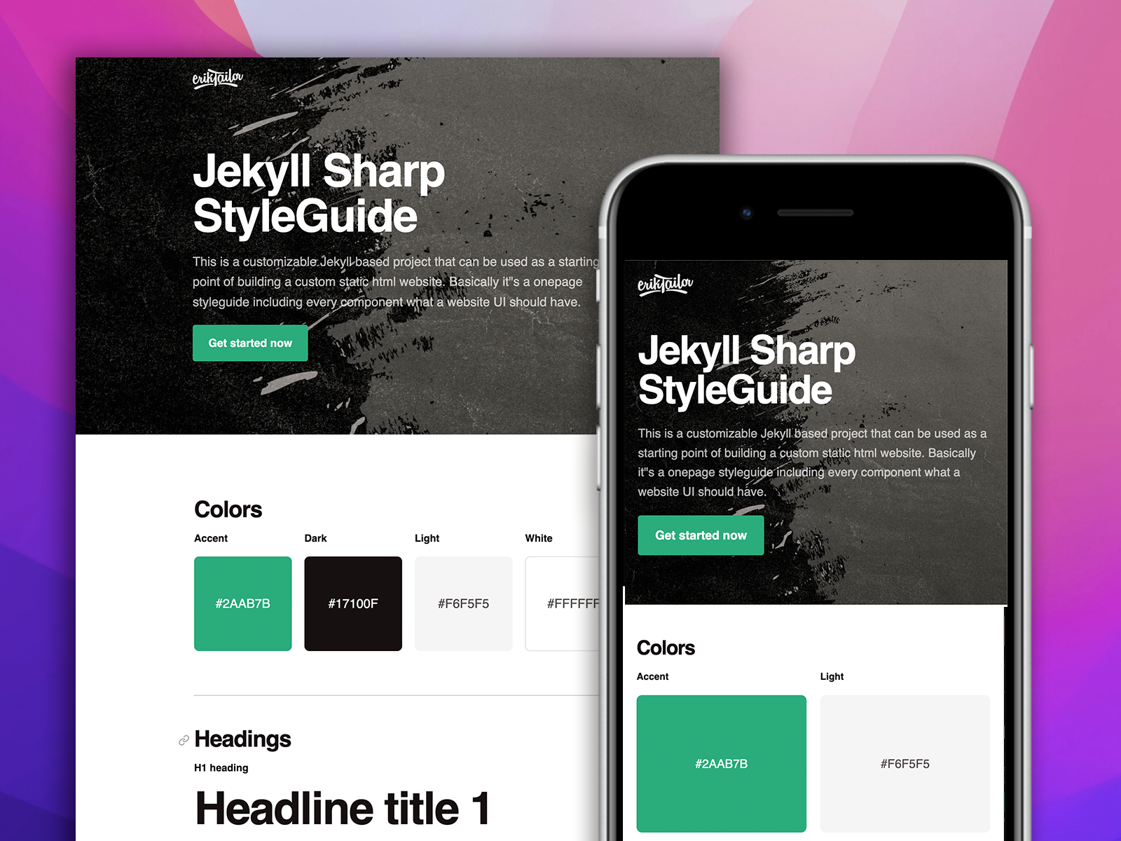
Colors
About painting, we will cover two types:
- coloring background
- coloring a text
Background color
The syntax would be the following: .bg-<color>. Colors can be these by default:
- accent: #2AAB7B
- dark: #17100F
- light: #F6F5F5
- white: #FFFFFF
.bg-accent {
    background-color: $accent;
}
.bg-white {
    background-color: $white;
}
Text color
The syntax is: .text-<color>. You can use the colors mentioned above. So let’s see examples:
.text-dark {
    color: $dark;
}
.text-white {
    color: $white;
}
Opacity
It works like this: .opacity-<number>. Numbering is by tens, if it’s lower, the opacity of the element is as low as that value:
.opacity-70 {
    opacity: 0.7;
}
.opacity-20 {
    opacity: 0.2;
}
Display
The last one is making the display css attribute easier to implement. The syntax is .d-<value> .
- none: don’t display at all
- block: display as block
- inline-block: display as an inline block
- inline: display as an inline elemenet
.d-block {
    display: block;
}
.d-none {
    display: none;
}
Note: You will find the sources of these helper classses in the
_sass/_helpers.scssfile.
Editing layouts
In this styleguide template I only use a single layout, the default one at _layouts/default.html.
You have to edit this file if you may want to:
- edit the
<head>contents - modify the wrapper elements of the main content
- add / remove lightbox, page loader, header, footer, etc.
- add scripts manually to the bottom of the page
Note: You are always free to create as many layouts as you need, according to Jekyll’s layout documentation for more information on using layouts.
Deploy your site
When you feel ready, and satisfied with the result, you may want to deploy the project to a website. If you planning to use GitHub Pages, you can find a great tutorial on this written by me.
Resources
Third-party assets
- Feather Icons - 260+ scaleable vector icons included and ready to use
- SimpleTooltip - adds a tooltip function where needed
Jekyll plugins
- jekyll-autoprefixer - add vendor prefixes for browser compatibility to css output
- jekyll-minifier - plugin to compress & minify html, css, js files
Note: these jekyll plugins are not supported by GitHub Pages, so if you plan to host your website with it, you have to know that these plugins won’t work.